Hey there!
This is Tear Them Down - Product Teardown case study #12.
If you are building (or looking to build) great products for your users, you will love our case studies!
On a fine morning, suddenly I got curious about Audiobooks and started exploring apps that give the same. I came across Blinkist giving short summaries of popular books. Looking at it through the lens of a product person, there are 8 interesting lessons on learning about users, onboarding carousel, etc. I strongly recommend going through the full case study (4 min read), but key lessons are listed at the end of this if you do not have time.
1. Onboarding Carousel
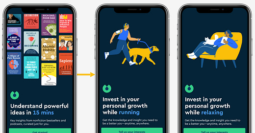
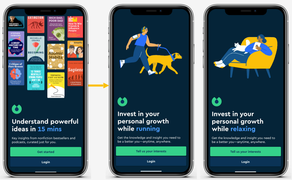
When I opened the app for the first time, after the splash screen, I saw the above screens explaining what Blinkist is and when to use it.
😊What is good here?
The first screen explains what Blinkist’s USP is and shows some popular books - which builds confidence in the whole platform. This approach of showing content available works particularly when the content you own is very popular.
On the subsequent screen - an animated screen with when to use, it clearly shows when I can use Blinkist. Another great thing about this screen is that it does not need me to manually swipe and see each situation - it is an animation/auto-swipe.
These 2 screens completely helped me understand when to use and how to use the app.
Lesson 1.1: Use splash screen/onboarding carousel to educate user on the USP and when to use the product. Be sure to AB test and see if this is leading to any negative impact before rolling it out to all the users.
😟What is not good here?
This is already 2 screens before I start the onboarding or log in. Both could’ve been fit into 1 screen with the green button (CTA) being “Tell interests and get started”. Onboarding is needed as the app needs a user’s information. It is not a user-delight step.
Lesson 1.2: Make the onboarding as short and simple as possible. From a user’s point of view, it is usually a friction and not a delightful experience.
2. Learning about the user - Mandatory steps
After the onboarding carousel, when I chose - “Tell us your interests”, instead of log-in in or account creation, I saw the above steps where Blinkist is trying to learn about me.
😊What is good here?
This survey screen has a progress bar to know how many steps I need to do. The questions and topics are easy to understand.
From the app’s point of view, this survey helps them understand the user, built their interest graph very early on, and personalize the app/recommendations accordingly.
Lesson 2.1: Use progress bars when there are multiple steps. If the number of steps is not too much (usually ~3), this can motivate a user to finish.
Lesson 2.2: For your personalization/recommendations to work well, learn about the user and build their interest graph as early as possible. This will help the user reach the aha moment quickly.
😟What is not good here?
It looks like it is mandatory to answer there - as there is no skip option. So instead of just making it like a Q&A, they could’ve explained how they will use this - so that I can feel secure about my data and give it accordingly.
Lesson 2.3: When collecting user information, be transparent and state where/how you would be using it. This can act as a huge trust/motivation booster.
👋[Optional] Good to have:
When there are surveys with options for users to select, to finish it quickly, users might select the first option and click submit.
Lesson 2.4: In surveys, sort the options differently for different users and track which option and option’s position users are selecting. Analyzing that data can help you understand if you see that behavior among your users or not.
3. Learning about the user - Optional steps
After answering the above 2 questions, I was asked to indicate the titles that interest me from the books they are showing. This is an optional question - as there is a “Skip” button above.
😊What is good here?
After I have given my interest, instead of just directly showing a loader or landing me on the home screen, they used the opportunity to educate me on where I can find these titles and how I can use the library feature. As a user, it just felt like the right point to learn this.
Lesson 3.1: Identify the right context and educate the user about the feature. This can help improve adoption better and among the right audience.
Additionally, after submitting the responses, they took some time to personalize my experience. Instead of just showing a loader or empty screen, they have used it to show progress and educate me on what’s happening. This builds a stronger case for me to wait - instead of dropping off.
Lesson 3.2: Whenever there is loading, instead of using loaders or blank pages, use the space to show progress and educate the user. This can reduce drop-offs at such loading screens.
Lessons from the Blinkist app:
Lesson 1.1: Use splash screen/onboarding carousel to educate users on the USP and when to use the product. Be sure to AB test and see if this is leading to any negative impact before rolling it out to all the users.
Lesson 1.2: Make the onboarding as short and simple as possible. From a user's point of view, it is usually a friction and not a delightful experience.
Lesson 2.1: Use progress bars when there are multiple steps. If the number of steps is not too much (usually ~3), this can motivate a user to finish.
Lesson 2.2: For your personalization/recommendations to work well, learn about the user and build their interest graph as early as possible. This will help the user reach the aha moment quickly.
Lesson 2.3: When collecting user information, be transparent and state where/how you would be using it. This can act as a huge trust/motivation booster.
Lesson 2.4: In surveys, sort the options differently for different users and track which option and option’s position users are selecting. Analyzing that data can help you understand if you see that behavior among your users or not.
Lesson 3.1: Identify the right context and educate the user about the feature. This can help improve adoption better and among the right audience.
Lesson 3.2: Whenever there is loading, instead of using loaders or blank pages, use the space to show progress and educate the user. This can reduce drop-offs at such loading screens.
If you are building (or looking to build) great products for your users, you will love our case studies!
Will come back with another interesting case study. Bye!


Insightful and worth read
Thank you for sharing this.