Hey there!
This is Tear Them Down - Product Teardown case study #14.
If you are building (or looking to build) great products for your users, you will love our case studies!
I have been using Pocket App for a few years now. But the thought to write about it came after one of our subscribers Abdul Majid requested it. Pocket app has a very small team - yet they were able to grow a lot. I read a lot, hence I use Pocket app a lot to save my reads, tag them and make notes. Looking at it through the lens of a product person and a first-time user, there are 6 interesting lessons on improving user retention. I strongly recommend going through the full case study (5 min read), but key lessons are listed at the end of this if you want to be quick about it and come back for the complete details later.
PS : I’ve written the rest of this post from the lens of a first time user.
1. User education
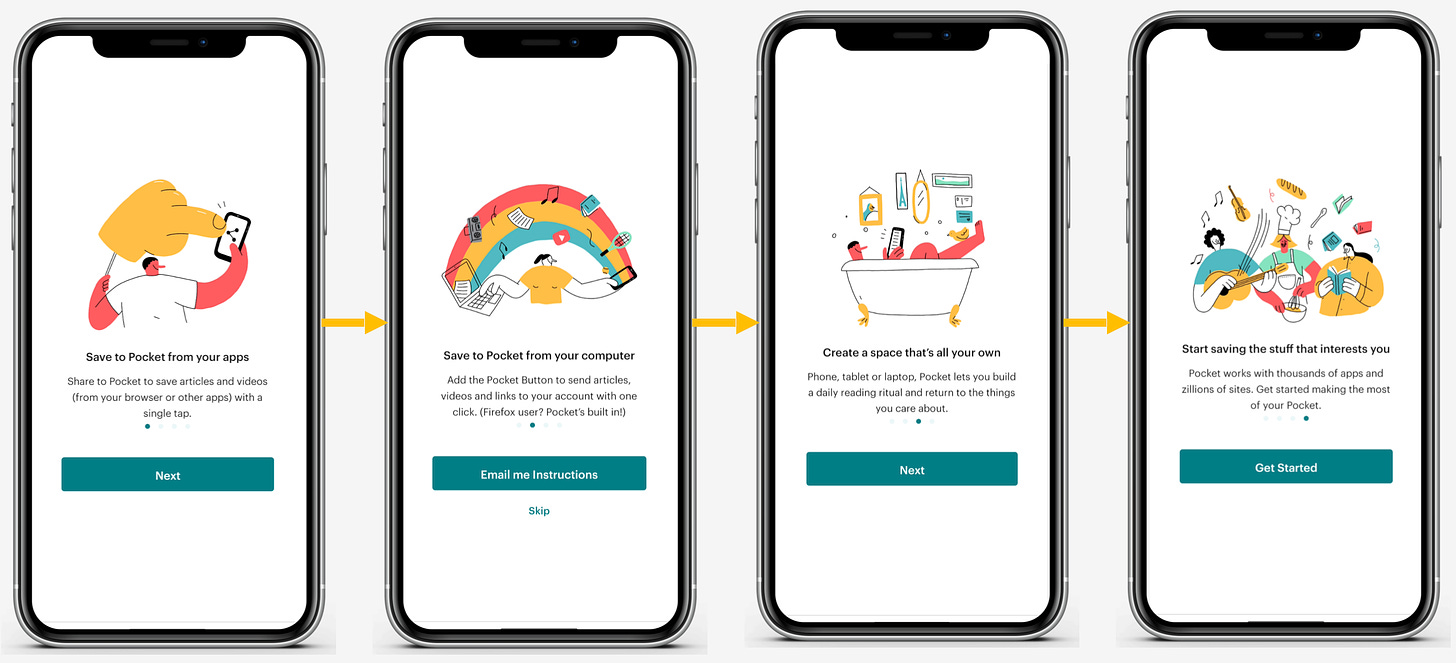
After I installed and logged into the app, I landed on this carousel.
😊What is good here?
As a new user of the Pocket app, this carousel is helping me understand how I could use the app. If you notice, the CTAs (Call to actions) on each page are different. The second screen talks about using it on the computer but the user is on the mobile - they have used this space to tell the user that it is available on the desktop also. Instead of showing instructions to the user here itself, in which case the user would just forget, they gave the option to read in email. They have understood the audience and their setup - hence delivered awareness that it can be used across all platforms and instructions on how to use it across devices.
Instead of this approach, they could’ve used tooltips in-app to show how to use the app. But most users have already built blindness for tooltips/walkthroughs and usually skip. The way they did it helps users remember better.
Lesson 1.1: Understand your users, and their setup and deliver the right messaging to improve awareness about your platform.
Additionally, they made this whole thing unskippable. So a user has to view all. This could lead to drop off but such a user is more likely a poor quality user. Pocket’s users are people who read - so this makes sense. Additionally, if they communicate how to use it better, it could help users adopt and use it better and hence get retained better.
Lesson 1.2: When giving instructions, you can make them unskippable. But this could lead to poor conversion. Know your audience, AB test, and identify if making it unskippable is adding value or not - not only for short-term conversion but in terms of long-term retention and usage.
😟What is not good here?
I definitely want to know how to use the app. But I felt like 4 steps are a lot and redundant. They could try and shorten to fix info within 3 steps. Remove redundant steps or excessive steps early in a user’s funnel to reduce cognitive load on the users in the very beginning itself.
Lesson 1.3: Have as few steps in onboarding as possible and drive early value realisation or aha moment.
2. Permissions
After the carousel, once I landed on the homepage, I saw this popup asking me for permission to send notifications. In older Androids, apps can automatically send notifications and users can opt out by going to settings if not interested. From Android 13, users by default won’t be opted-in for notifications and apps have to request users for permission to send notifications.
😊What is good here?
Instead of asking me right after I opened the app, they let me take a few actions, build awareness about the app, and then asked for permission. This improves the chance of me (or any user) giving permission.
Lesson 2.1: Identify the delight points and request permissions at that point to improve the chances of getting the permission.
Additionally, instead of directly giving the 2nd popup (which is Android’s default), they gave a first popup explaining why I should give access. This helps in 2 ways:
Making users understand why they should give
If the user is not interested, they are not rejecting it on Android and only rejecting an internal popup. If a user rejects twice on the Android popup, the app cannot request again from the same user. This way of showing an additional popup reduces the risk of getting rejected twice on an Android popup.
Lesson 2.2: When requesting for permission, show an internal popup first and then trigger Android’s request popup - so that you can share why you need it and reduce the chance of completely losing out access.
3. App loading
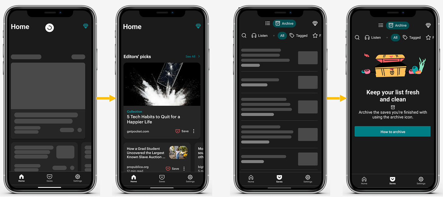
After I gave notifications permission, I saw my homepage still loading. It took ~10 seconds for the screen to load. I tried refreshing, and switching tabs but nothing loaded for some time (while I had a good internet connection).
😟What is not good here?
As a first-time user, I want to use the app properly. This experience of slow loading (while I did not even save anything yet), made it less credible and I would just close the app. Latency, slow loading, frozen frames, etc. very early in a user’s journey leads to poor experience and would lead to drop-off. Optimize the app to reduce such instances.
Lesson 3.1: Resolve for slow loading, frozen frames, latency, etc. in the app. These issues can lead to a poor experience and will impact all the metrics. As long as these issues exist, all the other features you build may not drive much impact.
Lessons from the Pocket app:
Lesson 1.1: Understand your users, and their setup and deliver the right messaging to improve awareness about your platform.
Lesson 1.2: When giving instructions, you can make them unskippable. But this could lead to poor conversion. Know your audience, AB test, and identify if making it unskippable is adding value or not - not only for short-term conversion but in terms of long-term retention and usage.
Lesson 1.3: Have as few steps in onboarding as possible and drive early value realization or aha moment.
Lesson 2.1: Identify the delight points and request permissions at that point to improve the chances of getting the permission.
Lesson 2.2: When requesting permission, show an internal popup first and then trigger Android’s request popup - so that you can share why you need it and reduce the chance of completely losing out access.
Lesson 3.1: Resolve for slow loading, frozen frames, latency, etc. in the app. These issues can lead to a poor experience and will impact all the metrics. As long as these issues exist, all the other features you build may not drive much impact.
If you are building (or looking to build) great products for your users, you will love our case studies!
Will come back with another interesting case study. Bye!


Welcome, thanks for helping me understand what makes an impact with users and what does not. Look forward to your next write up.
As usual great content, thanks a lot for sharing. For slow loading, what is your opinion about using Facebook Shimmer Effect? Will it help improve retention?