Hey there!
Welcome to 60 new product enthusiasts who have joined us in the last 1 week! This is Tear Them Down - Product Teardown case study #2. If you are building (or looking to build) great products for your users, you will love our case studies!
Sitting at home, working from home, bored at home… I was reading the news and got to know that Duolingo is headed for IPO. Wow!
While the language learning app is free to use, subscriptions (which <3% of users have taken up) for premium features drive the majority of the revenue. According to TechCrunch, Revenue in 2020 was ~$162 Million growing 129% YoY. In Q1 2021, revenue hit $55.4 Million with an annualized run rate of $220 Million.
🎉 Duolingo’s claim to fame is its UX: It has totally gamified learning with bite-sized lessons, badges, leveling, leaderboards, etc.
So I started looking at Duolingo through the lens of a PM. There are 9 interesting lessons on improving retention - from branding to gamification. I strongly recommend going through the full case study (5 min read), but if you do not have time, key lessons are listed down at the end of this.
PS: This is not a promotional post.
1. Branding
Most apps have a good logo or mascot. But none of the non-gaming apps have embedded the mascot in the user journey as effectively as Duolingo did. Everything - from navigating through a lesson to email or push notification communication is centered around the Duo (mascot owl). It is very creative! They established a deep relationship (almost like student-teacher) between the user and the mascot. 👏
Lesson 1.1: Embed the logo or mascot well into the user journey - this can build a strong recognition for your brand deep in the user’s mind.
2. Communication
I did not open the app for a few days and then received this email at around the same time of the day I used it before.
😊What is good here?
The Duo (mascot) is present here also. Communication is also centered around that. This is consistent with how they write in the app as well as in the push notifications.
This ties back to Lesson 1.1
The email I received is nearly at the same time of the day as I used earlier. So it is very likely that I am free again today also at around the same time. They reminded me to use it again at the right time! As they expected, I opened the app.
Lesson 2.1: Understand the user behavior - when the user might have time to use the app and nudge them at that time to get the best conversion.
😟What is not good here?
Do you see the Call to action button “Continue learning”? That is the key to make a user launch the app. While it is great that they added it instead of making me open the app myself (which I wouldn’t have), the button has very little focus. The Duo and the main text are grabbing more attention.
Lesson 2.2: Always give a Call to action button in your communication and make it prominent so that it gets the user’s attention.
3. Homepage
After I clicked on the CTA, I landed on the homepage. On scrolling through the left side screen, I see more lessons and checkpoints as shown on the right side screen.
😊What is good here?
I know which language I am learning. I clearly know what I completed, what I did not complete, what I do not have access to and which lessons I would have forgotten because of the break. I can very well understand the sequence in which I should take the lessons.
Lesson 3.1: When there are many options on a page, sequence them in the right order and make a clear distinction between what the user can access vs. cannot access.
😟What is not good here?
Given there are too many lessons on the homepage - this increases the number of options I have and makes it complex for me to make a decision on which lesson to pick. Hence it could be a friction point.
Lesson 3.2: When getting a user to reuse the app and if there are many options to choose from, clearly show what they could do first - in order to reduce the complexity in decision making for the user.
4. Lesson
I clicked on one of the broken lessons - to see how much I can recollect. I completed the lesson after some 10 or 15 questions.
😊What is good here?
I clearly know how much time it might take for me to solve the lesson because of the progress bar present at the top. If I know I have enough time, I will just finish it otherwise, I can simply close it.
Lesson 4.1: Wherever there are multiple steps, use progress bars to show the user how much time or how many steps it might take for them to complete and an option to close and come back later.
Even in between the lesson, I am not simply solving the questions. I am getting some motivation from the Duo. Very nice to see Duo motivating me to move forward. I am able to build a connection with the Mascot.
This ties back to Lesson 1.1
5. Gamification
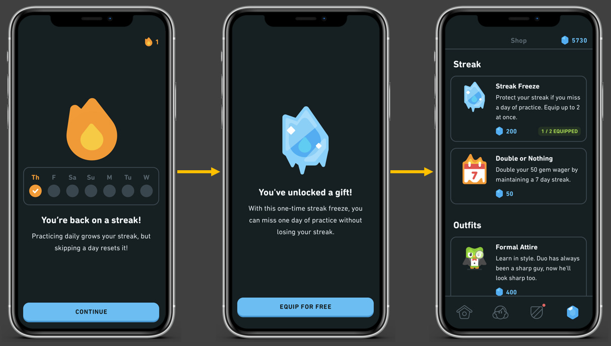
Once I finished the lesson, not only did I see a “Practice Complete” screen, I saw a series of screens which show me what I won because of taking a lesson.
😊What is good here?
It automatically added me to a streak and I can clearly see what that streak is and how simple it is to maintain a streak - I just need to keep coming back over the next few days. It attached a simple goal to my learning. This improves retention very easily!
Lesson 5.1: Use simple goals, gamification, and rewards as positive reinforcements to improve retention.
Also, I got a gift that helps me regain my streak even if I miss one day - fantastic. I am just coming after a break and I might not remember to open the app every day. So this reward gives me the motivation to come back even if I miss a day once in a while.
Lesson 5.2: It is not easy to reach goals - so give a clear path that motivates the users to come back even if they miss reaching the goal once.
😟What is not good here?
I started liking the app and I wanted to take another lesson soon after finishing the first one. But the rewards kept coming one after the other and there is no way out! They could have given a progress bar here also or a simple “Close” or “Equip later” option on the second screen.
This ties back to lesson 4.1
6. Retention
As expected, I could not open the next day. I opened it the day after that and it gave me an option to use the Streak Freeze and continue! Thank god I have enough gems to help me continue my goal. I do not have to get demotivated because of not using for a day.
This ties back to lesson 5.2 and an additional (but optional) lesson is…
Lesson 6.1: For users who are demotivated because of consistently missing goals, have something else that can keep them engaged.
Lessons from Duolingo’s gamification:
Lesson 1.1: Embed the logo or mascot well into the user journey - this can build recognition for your brand deep in the user’s mind.
Lesson 2.1: Understand the user behavior - when the user might have time to use the app and nudge them at that time to get the best conversion.
Lesson 2.2: Always give a call to action button in your communication and make it prominent so that it gets the user’s attention.
Lesson 3.1: When there are many options on a page, sequence them in the right order and make a clear distinction between what the user can access vs. cannot access.
Lesson 3.2: When getting a user to reuse the app and if there are many options to choose from, clearly show what they could do first - in order to reduce the complexity in decision making for the user.
Lesson 4.1: Wherever there are multiple steps, use progress bars to show the user how much time or how many steps it might take for them to complete and an option to close and come back later.
Lesson 5.1: Use simple goals, gamification, and rewards as positive reinforcements to improve retention.
Lesson 5.2: It is not easy to reach goals - so give a clear path that motivates the users to come back even if they miss reaching the goal once.
Lesson 6.1: For users who are demotivated because of consistently missing goals, have something else that can keep them engaged.
Another interesting case: Giving simple cashback and rewards might attract scammers and it might not be possible to retain them but Fi, a neobank, is using choice-based rewards to improve retention by understanding their customer mindset well - check a simple explainer on our LinkedIn post (0.5 min read). While you are there, we just started building our LinkedIn community.
Follow for more content, tips & hacks on products! Show some love :)
We have spent ~18 hours crafting this case study. Take 5 seconds out to share it and help us grow! 😃
Will come back next Thursday with another interesting case study. Bye!


Amazing again, can you also do a product stack analysis for any one of India's prominent Neobanks (Jupiter, Niyo, Fi)?