Hey there!
Welcome to 109 new product enthusiasts who made our product community 245 members strong over the past few days.
This is Tear Them Down - Product Teardown case study #5. If you are building (or looking to build) great products for your users, you will love our case studies!
I enjoy trading - making some quick $$s. In fact, I spend quite some time in a day in front of trading apps. I recently picked up the habit of trading US stocks. But I do not know much about the market. So before I go ahead and invest 1000s of $s, I thought I should start small and learn. For this, I have been using an interesting app called Gotrade that lets me invest even with $1.
When I looked at it through the lens of a PM, there are 7 interesting lessons on Search, Push Notifications, NavBars, etc screens. I strongly recommend going through the full case study (5 min read), but key lessons are listed down at the end of this if you do not have time.
PS: This is not a promotional post. But if you need a referral, feel free to reply.
1. Push Notification
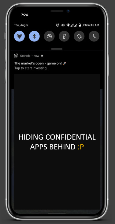
I am from India and trading in the US starts at around 7 PM IST. See the notification I got from Gotrade? It is about the market opening. I receive that notification every day at around the same time.
😊What is good here?
Gotrade understood that I would want to check my portfolio at the market opening. So by sending this notification, it reminds me that I should check the market and this could improve the chances of me opening the app.
Lesson 1.1: Understand the user behavior - when the user might have to use the app and nudge them at that time or after that action to get the best conversion.
This lesson was also identified in an earlier case studies on one of the most loved products - Duolingo. It is one of our most read case studies - Don’t forget to check it out when you get time!
2. Homepage
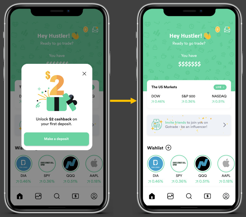
When I click on the push notification, I land on this homepage.
😊What is good here?
This homepage is very simple and gives all the information I need. When I open the trading app, what do I usually want to see? Market movement, my watchlist performance, and My money. This dashboard gives that summary very well without overwhelming me with too many stats.
Lesson 2.1: Research what your users would like to see on a screen or users’ “Jobs To Be Done” and design the screen for those needs.
Jobs To Be Done is a great framework to figure out customer needs.
There is a referral campaign and a cashback reward program going on. The referral campaign is shown on the homepage with a banner and the cashback reward program is shown with a popup every time a user lands on the homepage. The banner is subtle and is not the most catchy thing on the screen - letting me focus on other important things on the screen.
Lesson 2.2: Do not make campaign banners or popups the most important thing on a screen. Design and place them in such a way that they are highlighted but are not intrusive.
😟What is not good here?
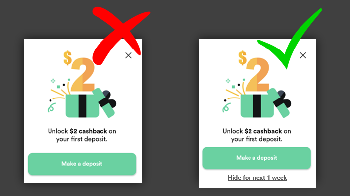
The banner mentioned above was very nicely done. But the popup comes every time I open to homepage - even without opening & closing the app! It is annoying. Moreover, there is no “Do not show me again” option either. I know Gotrade wants me to act on the campaign and get the reward. But if as a user, I do not have the intent of doing that, no matter how many times they show me - I will not do it!
I curse the designer/PM every time I land on the homepage because of this. It would’ve been better if they had given me an option to hide it. This can also be used to check how many of your users find the campaign irrelevant.
This ties back to lesson 2.2 and an additional lesson is…
Lesson 2.3: If there is a recurring popup setup, always give an option of “Do not show me again” so that the user can choose to stop seeing it if it is not irrelevant to the user.
🤔How it could’ve been:
Having a simple “Hide for the next 1 week” on the popup easily improves the UX of landing on the homepage and reduces the fatigue in using the app.
3. Analytics
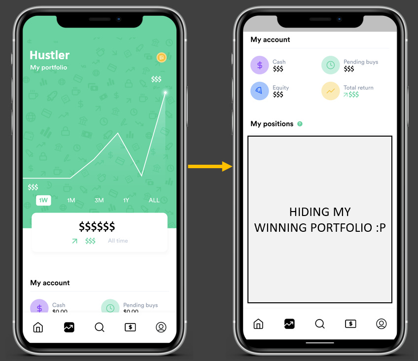
This is the second tab. This gives trends, KPIs to my portfolio, and the performance of each of my stocks. Even this screen is very simple with just 4 KPIs, a trend line, and a list.
😊What is good here?
When it comes to showing analytics, a lot of apps show too many details and charts which could confuse the users. But Gotrade again did a great job showing only what is important to its users.
This ties back to lesson 2.1
👋[Optional] Good to have:
Do you see the 4 KPIs Cash, Pending buys, Equity & Return? When I click on any of those 4, it gives a popup explaining the KPI. It is not very intuitive that I can click on those. So making those buttons stand out from the rest of the screen design could’ve helped identify that I can click on them for more info.
Lesson 3.1: If there are any CTAs or buttons on the screen, make them stand out from the rest of the screen - so that users know they can click.
4. NavBar
Do you see the navigation bar at the bottom of the screen? It has 5 tabs.
😟What is not good here?
As a new user, sometimes I may not be able to understand what each of those tabs represents just based on the icon. It requires cognitive effort from me.
Lesson 4.1: Do not impose a cognitive load on your users. In the navbar, show tab names also instead of only icons so that a user can navigate across tabs easily.
🤔How it could’ve been:
Giving names could make it much easier for me to understand the tabs and navigate - without having to put thought to determine what each icon represents.
5. Search
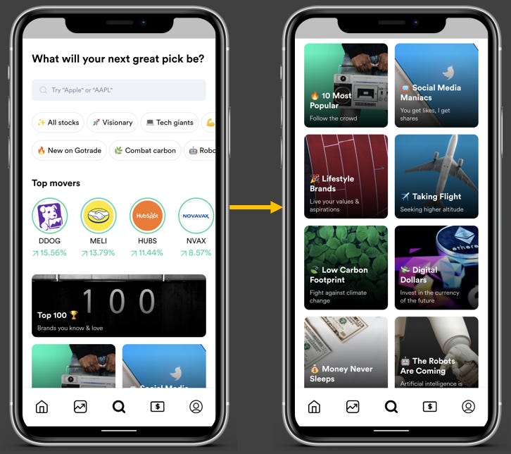
This is the search tab. The left screen is the landing one and on scrolling down, you get more grids as shown on the right screen.
😊What is good here?
I really love this tab. As a new entrant into the US market, I may not know many stocks. But the way they have categorized stocks into “visionary, tech giants, covid19, etc.” and grouped by industries, trending news, top movers, etc. helps me identify new stocks or even find the ones I want to find easily.
Lesson 5.1: Instead of giving a blank search or only giving recommendations after the user starts typing, use the initial blank space to give interesting insights/market-based recommendations.
Lessons from the Gotrade app:
Lesson 1.1: Understand the user behavior - when the user might have to use the app and nudge them at that time or after that action to get the best conversion.
Lesson 2.1: Research what your users would like to see on a screen or users’ “Jobs To Be Done” and design the screen for those needs.
Lesson 2.2: Do not make campaign banners or popups the most important thing on a screen. Design and place them in such a way that they are highlighted but are not intrusive.
Lesson 2.3: If there is a recurring popup setup, always give an option of “Do not show me again” so that the user can choose to stop seeing it if it is not irrelevant to the user.
Lesson 3.1: If there are any CTAs or buttons on the screen, make them stand out from the rest of the screen - so that users know they can click.
Lesson 4.1: Do not impose a cognitive load on your users. In the navbar, show tab names also instead of only icons so that a user can navigate across tabs easily.
Lesson 5.1: Instead of giving a blank search or only giving recommendations after the user starts typing, use the initial blank space to give interesting insights/market-based recommendations.
For some more interesting lessons, go through our case study on Duolingo. It is one of our most-read case studies.
We have spent ~15 hours crafting this case study. Take 5 seconds out to share it and help us grow! 😃
Will come back with another interesting case study. Bye!

