
9 actionable insights from Fitbit app
Product Teardown Case Study #4

Hey there!
Welcome to 31 new product enthusiasts who have joined our 136 member strong product community in the last 1 week.
This is Tear Them Down - Product Teardown case study #4. If you are building (or looking to build) great products for your users, you will love our case studies!
This week I am trying to identify actionable insights from an app which I use quite often. It may not be an app for masses but it surely has lessons suitable for every product person. This app syncs very well with the smart watch and gives me amazing insights on keeping me healthy. It is the Fitbit app!
When I looked at it through the lens of a PM, there are 9 interesting lessons on App layout, gamification, and subscription design. I strongly recommend going through the full case study (5 min read), but key lessons are listed down at the end of this if you do not have time.
PS: This is not a promotional post.
1. Homepage

I have been using Fitbit for a while now. This is the homepage I see when I launch the app. It has a lot of numbers and stats about my activity - using the data collected from my watch.
😊What is good here?
When I launch the app for the first time in a day, I see a new banner at the top (as shown on the left side screen) with some useful health tips or new feature announcements. It closes when I click ✖ or 👎 or 👍. This is particularly interesting because my full attention when I launch the app is drawn towards the banner and it is only temporary giving me my normal homepage back. It is a convenient way to communicate with the user and collect feedback instantly.
Lesson 1.1: Use temporary in-app banners to communicate with the users and have a feedback collection mechanism on the banner.
Also, if you notice on the right side screen, you will see an “Edit” button. It gives me flexibility to arrange the homepage as I want. Since Fitbit gives a lot of insights, all the insights might not be relevant to all users. Hence, there is a need for customization. But customizing from backend to cater to all different kinds of users could lead to infinite combinations - hence, difficult to implement. This simple “Edit” button can make it easy for users to customize the dashboard into whatever way they find useful.
Lesson 1.2: When customization from backend is difficult to implement, give the users an option to customize the app themselves.
2. Subscription / Premium

Although Fitbit app is free to use (with the watch), some features are premium only. The above screens are when I am trying to subscribe to premium.
😊What is good here?
All the snippets above are of the same page - scrollable (left screen is the top -> middle screen is the bottom). Irrespective of which position of the scroll level I am located on the page, I see the “Start my 90-Day Free Trial” grey button. Clearly, when it is in grey, it looks like it is disabled. When I click on it, it asks me to select “INR 99” or “INR 999” plan. Once I select, the button turns clickable and black. This mechanism is great because the key actions on this page for a user are to select the plan and to proceed - hence this mechanism puts full focus of this page on those key actions.
Lesson 2.1: Page should be designed and structured in such a way that the key actions a user should perform on the page are well highlighted.
Lesson 2.2: When there is submit button after selecting choices, disable the button till the user selects a choice but if the user clicks submit before selecting, nudge the user to make the selection.
😟What is not good here?
I am a free user. I did not activate premium yet. I want to know what is in the premium version that is not in the free version to assess if buying premium makes sense or not. This page gives a list of features that I get on premium. But I do not know if those features are also available on free or not. Fitbit being an app with so many features, it is hard to remember all the features present in free version. So a comparison between plans would have made my life easier. In fact, that’s how most websites show the difference between multiple subscription plans also.
Lesson 2.3: When you are trying to sell a premium subscription, clearly show the difference between the features on free version vs. premium version to maintain transparency and to make a user’s decision making simpler.
🤔How it could’ve been:
Using a comparison table to show the difference between free & premium versions would have made my decision making much simpler 😍

3. Tabs ➡ Community

In addition to the Homepage, there are 3 other tabs - Discover, Community and Premium. The above snippets are of Community tab.
😊What is good here?
Although I have been using Fitbit for a while, I never used “Community” tab. So when I go to that tab, instead of the page being blank for me, Fitbit highlighted why that tab on Fitbit is used and the key action I should perform while I am on this page.
This ties back to lesson 2.1 and an additional lesson is…
Lesson 3.1: In an empty state of a page, instead of leaving it blank, show the users how they can use that page and what they should do with clear CTAs.
👋[Optional] Good to have:
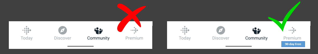
As we covered in the earlier section, premium is kind of a big deal for Fitbit app. It is present as one of the tabs, but that tab is not drawing a user’s attention right away. Also, they are giving 90-day free trial. But that offer is not surfaced anywhere and I do not see that until I go to the premium tab - which I usually avoid because I do not have a subscription. To draw user’s attention to that tab, they could have added a badge on the premium tab.
Lesson 3.2: Use badges (notification dots, tags, etc.) and other nudging mechanisms on tabs when there is something to highlight for that tab or when you think a user should be drawn to that tab.
🤔How it could’ve been:
Using a simple badge highlighting “90-day Free” would have drawn user’s attention easily 😍
4. Gamification

Fitbit gives cool badges when I do things like walking a lot or exercising a lot.
😊What is good here?
Gamification is a powerful to both improving user experience and retention. Whenever I receive an interesting badge “You have walked the entire length of New Zealand” or “50 floors in a day - Lighthouse”, it gives me a sense of accomplishment and puts a smile on my face.
Lesson 4.1: Use Gamification and Rewards to improve user experience and retention. These small things can make your product more enjoyable and interesting.
If you want to know how to ace Gamification, Duolingo is your master!
😟What is not good here?
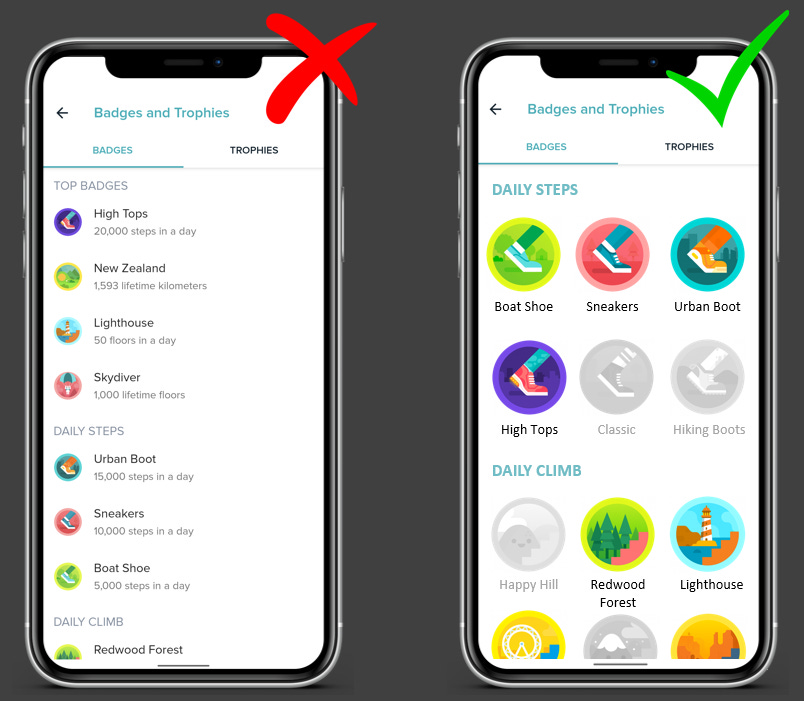
Well, I received interesting badges. Great! What next? What are the remaining badges? When will I receive another badge? What should I do for that? None of these details are available on the badges screen (left side screen from the above snippets). It is a total buzzkill if I do not get information on how to win another reward. How can I continuing playing a game that I do not know how to play?
Lesson 4.2: When you gamify, it is not only about giving rewards. Give the users a path on how they can navigate through your game - clearly define how to play and how to win.
🤔How it could’ve been:
Showing badges won in color and others in grey can help me check the remaining badges and understand what else I could do to win 😍
Lessons from Fitbit app:

Lesson 1.1: Use temporary in-app banners to communicate with the users and have a feedback collection mechanism on the banner.
Lesson 1.2: When customization from backend is difficult to implement, give the users an option to customize the app themselves.
Lesson 2.1: Page should be designed and structured in such a way that the key actions a user should perform on the page are well highlighted.
Lesson 2.2: When there is submit button after selecting choices, disable the button till the user selects a choice but if the user clicks submit before selecting, nudge the user to make the selection.
Lesson 2.3: When you are trying to sell a premium subscription, clearly show the difference between the features on free version vs. premium version to maintain transparency and to make a user’s decision making simpler.
Lesson 3.1: In an empty state of a page, instead of leaving it empty, show the users how they can use that page and what they should do with clear CTAs.
Lesson 3.2: Use badges (notification dots, tags, etc.) and other nudging mechanisms on tabs when there is something to highlight for that tab or when you think a user should be drawn to that tab.
Lesson 4.1: Use Gamification and Rewards to improve user experience and retention. These small things can make your product more enjoyable and interesting.
Lesson 4.2: When you gamify, it is not only about giving rewards. Give the users a path on how they can navigate through your game - clearly define how to play and how to win.
One more thing - We started sharing interesting job openings on our LinkedIn page. Do check out and tag anyone who might find the openings relevant.
We have spent ~16 hours crafting this case study. Take 5 seconds out to share it and help us grow! 😃
Will come back next Thursday with another interesting case study. Bye!