Hey there!
This is Tear Them Down - Product Teardown case study #9.
If you are building (or looking to build) great products for your users, you will love our case studies!
I was going on a long drive and to keep myself entertained I wanted to listen to music - I opened Spotify. Why Spotify, you ask? Good UX, Good Playlists, Good Recommendation system, etc.
I have been using Spotify for over 4 years, but I came across a few things that made me wonder if I have just started using it. Looking at it through the lens of a product person, there are 7 interesting lessons from all of its tabs. I strongly recommend going through the full case study (5 min read), but key lessons are listed at the end of this if you do not have time.
1. Home Tab
When I opened the app, I found a new section on the homepage asking me to pick some music I like. Clicking on “Choose Music” CTA opened a short survey.
😊What is good here?
A lot of times, surveys are just very text heavy and become a lot of cognitive load on users filling it. In this case, it is not text heavy but has good visual elements.
Lesson 1.1: Make surveys easy for users by making them visually appealing instead of relying on long text.
😟What is not good here?
I have been using Spotify for 4+ years now and it has full data on my listening habits. I am sure Spotify based on the data can easily figure out my likes and dislikes. It is confusing why Spotify is asking me again. Also, data gives better insights about me than what I would recollect and share with them.
Lesson 1.2: For users who have been using your app for a while, personalize the experience based on their usage data instead of asking the users for information.
Note: It might very well be an experiment they are running or a survey they are doing to see how their model is tying up to how I am thinking, etc. cases - but as a user, I am in the dark and I would’ve liked some output from filling this.
2. Search Tab
One of the tabs in the Spotify Navigation bar is “Search. Clicking on it, I land on screens as shown above.
😊What is good here?
As a user, I come to search when I want to find something specific. In Spotify, I get something better. While the core functionality of search is present, Spotify enhances my experience by making me discover more music by showing me different situations and categories.
How is this good for the user?
Spotify is helping me discover music based on what I am doing or my mood. This is better than just a search.
How is this good for Spotify?
The user is going to discover more music and listen more instead of just 1 song he/she was looking for. So users might spend more time on the app.
Lesson 2.1: Enhance a user’s search experience by helping them discover more items easily instead of just giving the traditional search bar
😟What is not good here?
Although Spotify gives interesting/relevant categories, topics, and languages there, those are not classified or ordered properly. Hence, finding the right one might be tough. They could’ve just classified these into sections (such as languages, mood, etc.) to help a user select easily.
Lesson 2.2: When there are a lot of options for a user to select from, categorize them into sections/give filters so that a user can make the choice fast.
3. Library Tab
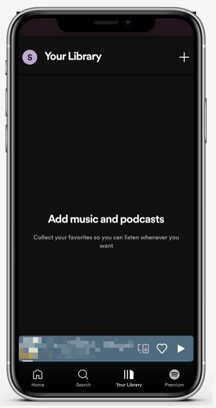
Although I have been using Spotify for a very long time, I never added any music to my library. So this tab was empty.
😟What is not good here?
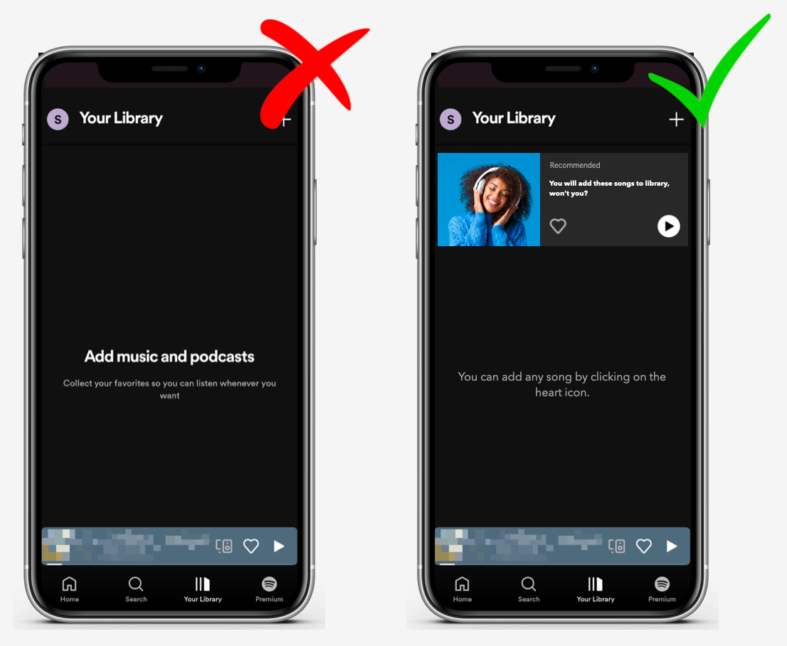
This screen is completely empty. I have never been made to use this feature, I have never used this feature - Hence one important tab became irrelevant to me. Instead of keeping it empty and not making me use it, they could’ve just given me the option to hide the tab and automatically unhide it if I do any relevant feature.
Lesson 3.1: Make a user’s experience simpler by hiding/giving them an option to hide unused/irrelevant functionalities.
🤔How it could’ve been:
If they really wanted to make me use it, they could’ve just simply made me try it first to show me its use. They could’ve just made me a list of favorites, which I could just tap ♥️ to add to the library. That would help me get used to it, start using the feature, and understand how it works.
4. Premium Tab
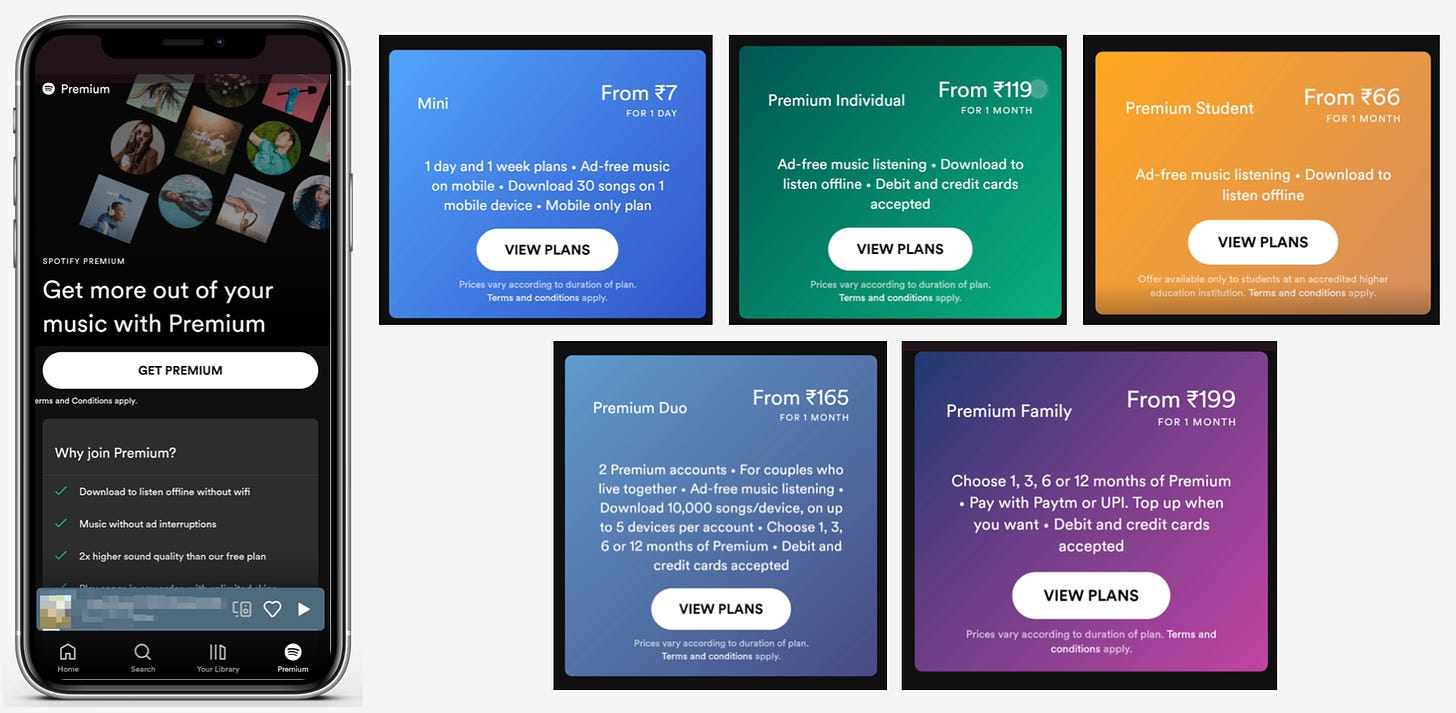
The last tab is the Premium tab - As I am a free user, it shows different plans they have and drives a user to subscribe.
😊What is good here?
If you have noticed in all tabs, the core action of playing the song - at the bottom, above the navigation bar is always available. It is present in every tab, making playing a song simple for the user - irrespective of where the user is.
Lesson 4.1: Do not hide the core action among the distractions. The core action of your app should always be easily accessible to the user.
😟What is not good here?
As I swipe through, there are 5 different plans with a lot of text and description. The first impression is that it is tough to read and choose. The user might just drop off here.
Instead of making a user read everything, they could give the option to get help picking the right plan. Once a user clicks on that, Spotify could ask a few questions that help filter the plan and accordingly recommend one/two plans. This makes it easier for users in subscribing.
Lesson 4.2: When there are a lot of plans available to subscribe from, make it easier for users in picking the right plan by helping them identify the most suitable one.
Lessons from the Spotify app:
Lesson 1.1: Make surveys easy for users by making them visually appealing instead of relying on huge text
Lesson 1.2: For users who have been using your app for a while, personalize the experience based on their usage data instead of asking the users for information
Lesson 2.1: Enhance a user’s search experience by helping them discover more items easily instead of just giving the traditional search bar
Lesson 2.2: When there are a lot of options for a user to select from, categorize them into sections/give filters so that a user can make the choice fast
Lesson 3.1: Make a user’s experience simpler by hiding/giving them an option to hide unused/irrelevant functionalities
Lesson 4.1: Do not hide the core action among the distractions. The core action of your app should always be easily accessible to the user.
Lesson 4.2: When there are a lot of plans available to subscribe from, make it easier for users in picking the right plan by helping them identify the most suitable one.
If you are building (or looking to build) great products for your users, you will love our case studies!
If you have some time, feel free to read through other top product teardowns:
Will come back with another interesting case study. Bye!


